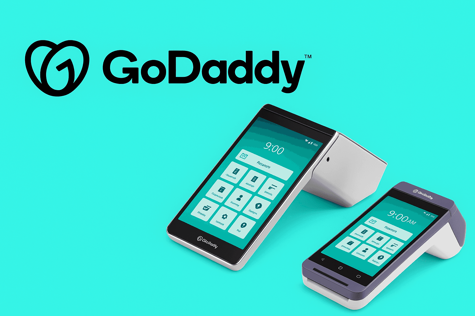
GoDaddy Smart Terminal Design System
Audited and rebuilt the design system for GoDaddy’s point-of-sale platform after the Poynt acquisition. Migrated from Sketch to Figma and created scalable UI components. The new system improved product consistency and cut dev time by 30% across teams.
Service
Design System, Product Design
Sector
Technology & SaaS
Year
2022
GoDaddy had recently acquired Poynt – a point-of-sale platform for small businesses – and needed to integrate and standardize the user experience across new POS products.
The challenge was two-fold: first, merchants using Poynt’s hardware and apps were facing inconsistencies in the interface (a result of rapid feature growth without a unified design language).
Second, the development team was spending extra time building similar UI components for each new feature, which slowed down product releases.
We needed a cohesive design system to streamline the POS app and terminal interface, making it easier for merchants to use and easier for developers to build upon.

01.
Legacy System Documentation
Migrated the outdated design assets from Sketch to Figma, restructuring broken components and styles.
Documented the existing design components, categorizing them into usable elements to streamline future updates and maintenance.
02.
User Research & Personas
Conducted in-depth research to understand the primary users: small business owners and merchants with limited time and technical knowledge.
Created personas and user journey maps, focusing on merchant pain points and needs within a POS system to ensure the design system addressed real-world use cases.
03.
Design System Integration
Built an updated design system that incorporated GoDaddy's branding while respecting Poynt's established user base.
Consolidated typography, color schemes, and interactive components to create a seamless brand experience.
Developed variants and adaptive components to ensure consistency across all interfaces and interactions.
04.
UI & UX Optimization
Conducted multiple UX reviews to identify and resolve usability issues within the POS experience.
Refined flows based on user feedback, simplifying interactions and enhancing usability.
Implemented a modular design approach, making it easier for developers to build and maintain new features with minimal effort.
The result was a robust design system documentation (in Figma and ZeroHeight) that included a library of reusable components, a style guide (colors, typography aligned with GoDaddy’s branding), and usage guidelines for interactions.
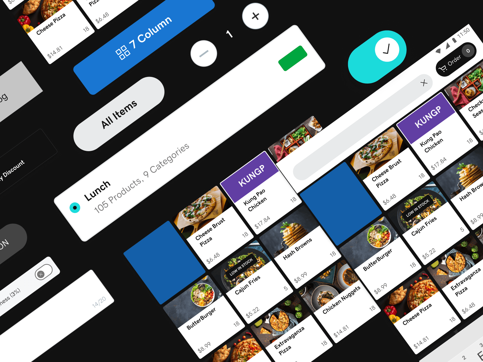
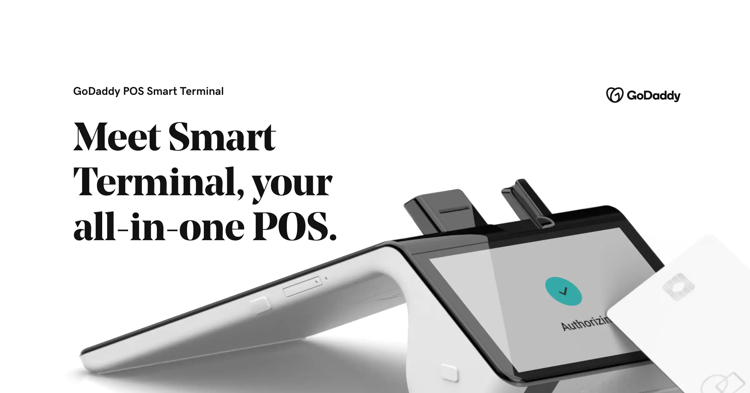
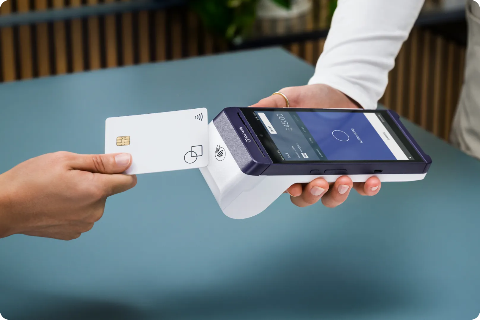
We revamped the POS app’s UI using these new standardized components – for example, the payment process screens and inventory management screens now shared a consistent layout and design language. This made the experience more predictable and easier to learn for merchants. We also updated the smart terminal’s interface, so that the customer-facing and merchant-facing screens felt cohesive.
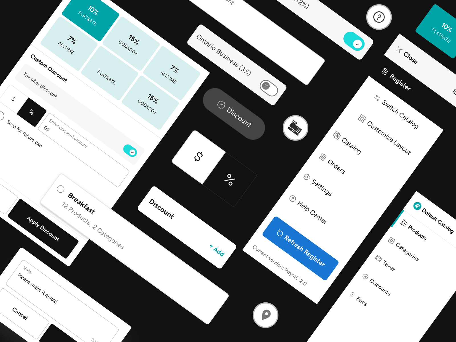
Importantly, the design system was built to be scalable: new features (or even new products, like a future tablet app or integrations for large clients) could be designed much faster by leveraging the established patterns.
-> 50% reduction in design-to-dev time through a reusable system
-> Consistent UI across web and mobile POS touchpoints
-> Positive feedback from merchants on usability improvements
-> Enabled faster onboarding for new merchants
-> Scaled design system adoption across internal teams


MORE PROJECTS