Hotspotty Redesign
Led the UX strategy and design system across Hotspotty’s web and mobile tools for Helium hotspot management. Unified fragmented experiences, simplified complex data, and improved product cohesion — driving growth and user adoption.
Service
UX design, Website design, Design system, Leadership
Sector
Web3
Year
2022
Hotspotty is an all-in-one tool for managing hotspots on the Helium network (a decentralized wireless network for IoT devices powered by cryptocurrency).
The team behind Hotspotty was rapidly adding features – a web dashboard for hotspot owners, a network explorer (HNTScan), and a mobile app called Hotspotty Connect – and the user experience was becoming fragmented.
New users found the ecosystem confusing: each tool had a slightly different interface and it wasn’t clear how they all connected. The challenge was to unify the design across these platforms and present complex data (like radio frequencies, device earnings, coverage maps) in a way that both crypto enthusiasts and everyday users could grasp.
Essentially, we needed a cohesive UX strategy to make Hotspotty’s suite feel like one product, with a consistent look and intuitive feel.

01.
Stakeholder Validation and Ecosystem Alignment
Collaborated with stakeholders and key device manufacturers to understand the requirements for integrating PCN (Pollen) payments alongside HNT.
Defined workflows and set expectations to address both legacy user needs and the demands of the expanding user base.
02.
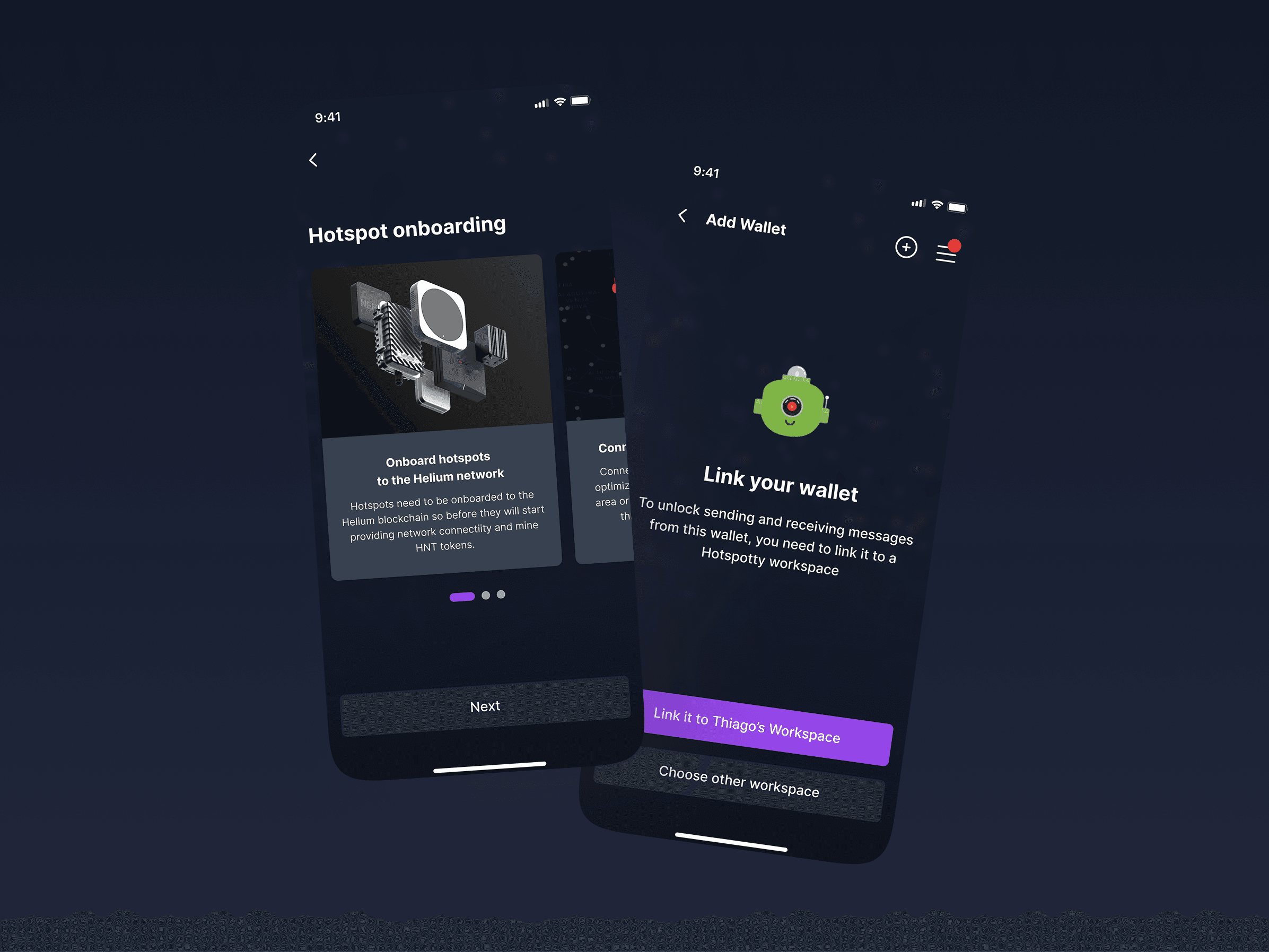
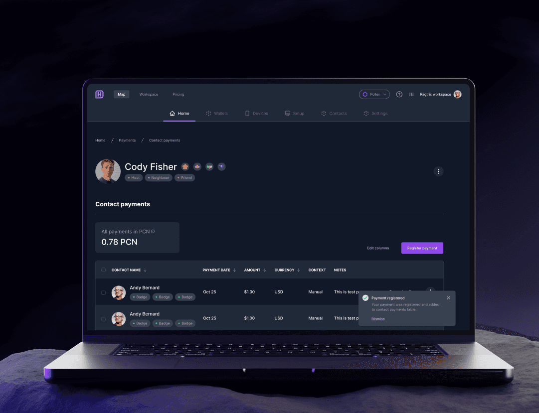
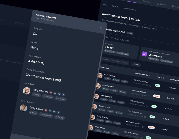
Introducing Support for PCN Payments
Designed and implemented an updated interface to seamlessly manage payments across Pollen and Helium networks.
Created workflows to allow effortless toggling between ecosystems, ensuring compatibility and ease of use for all users.
03.
Unified Dashboard Redesign
Developed a streamlined dashboard layout for managing payments, commissions, and reports with enhanced filtering options and clear visual indicators.
Introduced features for registering payments, attaching notes, and categorizing contacts for improved administrative efficiency.
04.
Enhanced Reporting and User Insights
Launched a commission report dashboard with detailed analytics, enabling users to gain insights into transactions and payouts.
Improved the visual hierarchy to make data interpretation straightforward, catering to both novice and experienced users.
We rolled out a unified design across all Hotspotty products. The web app, explorer, and mobile app now shared a common navigation scheme and visual style. I documented the new design system thoroughly, which included guidelines for typography, color usage, iconography, and even interaction patterns (like how modals or notifications should appear).
This became the single source of truth for designers and developers working on any part of the Hotspotty ecosystem. One tangible improvement was the onboarding experience: we created a guided setup that helped users link all the tools together (so a new user would understand that their Hotspotty account works on the web dashboard, the Connect app, and so on).
By standardizing elements like the account menu, settings pages, and data tables, users no longer had to re-learn the interface when switching from, say, the coverage map tool to the payments management tool – it was a seamless transition. We also leveraged community feedback (via Discord channels and beta tests) to fine-tune the usability of features, ensuring that even non-technical users felt comfortable using Hotspotty to manage their Helium hotspots.
-> Unified fragmented UX across web, mobile, and explorer
-> Created scalable design system for new features
-> Increased engagement from power users and partners
-> Improved data readability and performance tracking
-> Strengthened Hotspotty’s visual identity across products


MORE PROJECTS